Unlocking Creativity: Design Tips for Eye-Catching Print Materials
- Glenn Pollack
- Jul 5, 2023
- 3 min read

In the realm of print materials, an effective design can make all the difference. Whether you're crafting brochures, business cards, or posters, it's critical to focus on creating something that not only captures attention but also communicates your message clearly and effectively. At PGS Printing and Graphics, we understand the importance of this process and are here to guide you through it. With a bit of creativity and a grasp of some fundamental principles, you can create fantastic designs that truly stand out. So, fasten your designer's hat and join us as we explore the fascinating world of color, typography, and layouts!
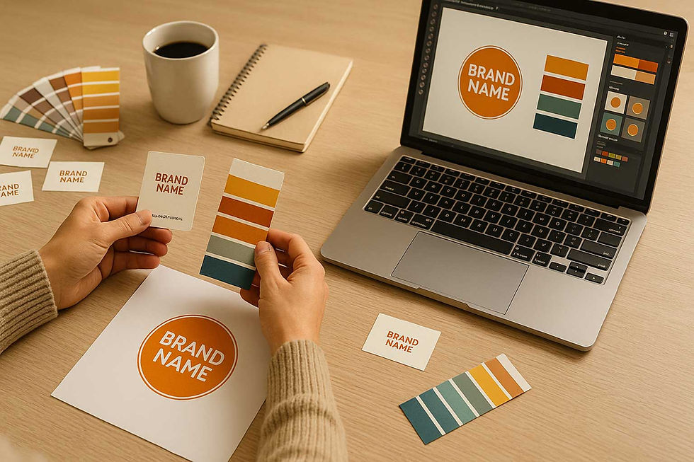
The Magic of Color: Painting Your Print Material’s Soul
Much like the spices in a well-crafted dish, colors add flavor and depth to design, evoking a range of emotions and setting the mood for your piece. Picking the right colors is vital and can make your print materials come alive.
Embrace Creativity with Color Theory
Understanding the basics of color theory is fundamental to creating a color palette that embodies the message and mood of your print materials. Complementary colors offer a sharp contrast and are great for drawing attention, while analogous colors create a sense of harmony and balance.
Stick to Brand Colors
If you're designing for a specific brand, consistency is key. Ensure you adhere to the brand's color scheme to enhance brand identity and create a cohesive look and feel across all print materials.
The Art of Typography: Let the Letters Dance
Words alone are potent tools of communication, but the visual representation of these words can significantly enhance their impact.
Choose Legible Fonts

While elaborate and decorative fonts may seem appealing, they aren't always the best choice for readability. Opt for fonts that are not only pleasing to the eye but also easy to read to ensure your message comes across clearly.
Play with Font Pairings
A combination of a bold headline font and a more subdued font for the body text can create a visual hierarchy in your design. This dynamic duo guides the reader's eye through the content and enhances the overall aesthetic.
Layout and Composition: Building the Framework
A carefully considered layout serves as a guide, leading your audience through the content in a logical and pleasing manner.
Use White Space Wisely
White space is a powerful design tool, and there's no need to be afraid of leaving some areas of your design blank. Intelligent use of white space can draw focus to key elements and foster a clean, professional appearance.
Align Elements for Cohesion
Alignment is crucial for creating a sense of cohesion and order in your design. By aligning text and other elements, you can create clean lines that make your print material easier to digest and more visually appealing.
Images and Graphics: The Visual Cherry on Top
Images are a powerful storytelling tool and can significantly enhance the impact of your print materials if used correctly.
Opt for High-Quality Images
Nothing detracts from a design quite like a blurry image. Always use high-resolution images to ensure your print materials look professional and polished.
Ensure Relevance
Make sure to choose images that not only resonate with your audience but also are directly relevant to your content. Relevant images add value to your print materials and make them more engaging.
With these tips and techniques under your belt, you're well on your way to unlocking your creative potential and creating standout print materials. Great design is a careful blend of art and strategy, so don't be afraid to be bold and innovative, but remember to always keep your audience and message at the heart of your decisions. If you ever need assistance in bringing your print materials to life, remember that PGS Printing and Graphics is just a call away. Happy designing!


Comments